Data physicalization
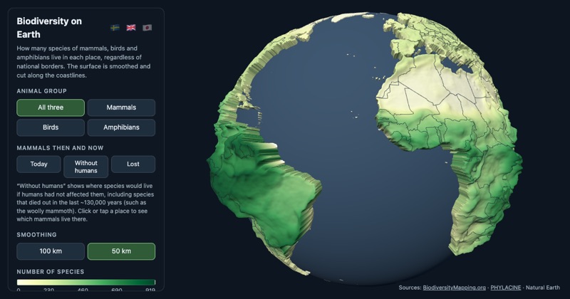
A globe of where the species are
An interactive globe where the land rises with the number of mammal, bird and amphibian species living there. It can also show which mammals would live in a place without humans, and it exports as an 8 cm two-colour 3D print.
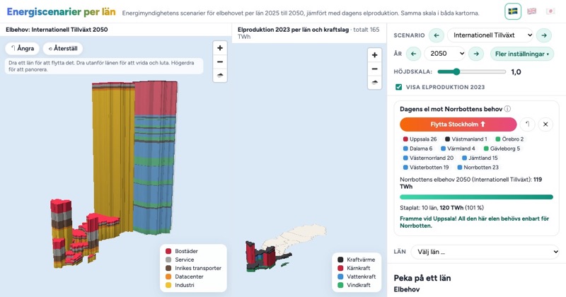
How much electricity will Norrbotten need?
The Swedish Energy Agency's scenarios for electricity demand per county, 2025 to 2050, as 3D bars next to today's production at the same scale. In the highest scenario you can stack the production of ten counties before you reach what Norrbotten alone would need.
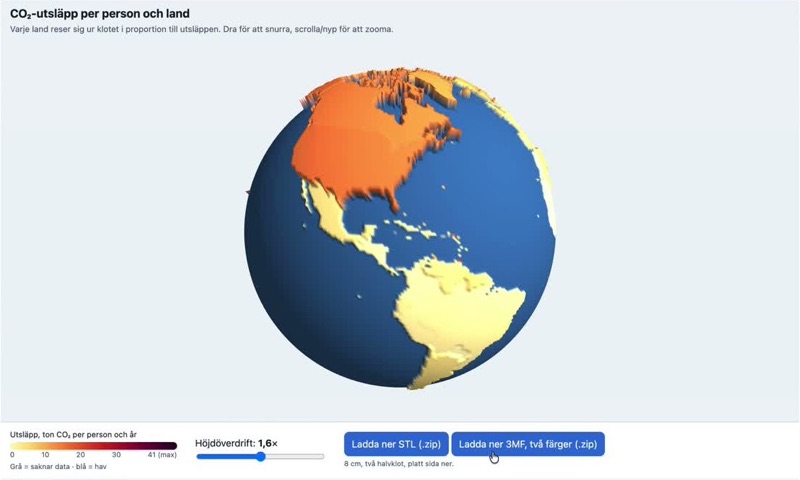
A printable globe from one prompt
At a teacher training day at Vetenskapens hus I showed how a free AI chat account turns a climate dataset into a 3D-printable globe in about four minutes. What that means for teaching with physical data.
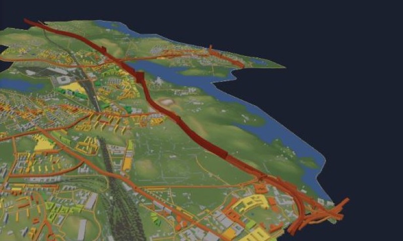
Solna's emissions as pillars of gas
The 3D map of Solna now shows greenhouse gas emissions: a 1×1 km grid from SMHI and, for every road link, one year of traffic exhaust drawn as a pillar of pure CO₂ gas at true scale.
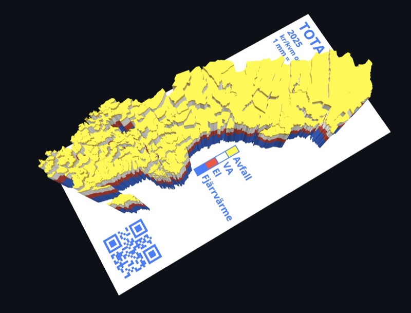
Housing costs in four colours
Thirty years of the Nils Holgersson reports as a printable map of Sweden: district heating, electricity, water and waste stacked as four coloured layers, at a fixed 1 mm per 10 kr/m².
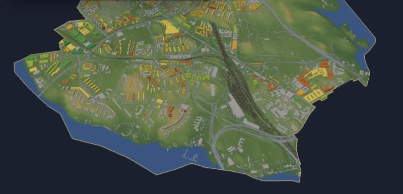
Solna in 3D: terrain, buildings, energy classes and plans
An interactive 3D map of Solna that you can also print: terrain, every building, the energy class of apartment blocks and premises, and the volumes that new detailed plans allow.
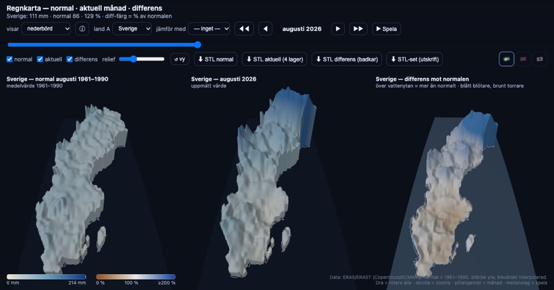
A rain map that updates itself
Monthly precipitation as 3D surfaces on the curved Earth, side by side with the 1961–1990 normal. The Swedish map now refreshes itself every month as soon as new ERA5 data is out.
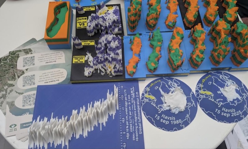
What worked at ForskarFredag: half-globes beat paragraphs
Notes from showing 3D-printed climate models to the public at ForskarFredag 2026. The Arctic sea ice half-globes needed no explanation, the layered Sweden models needed a legend, and our printed info cards had far too much text.
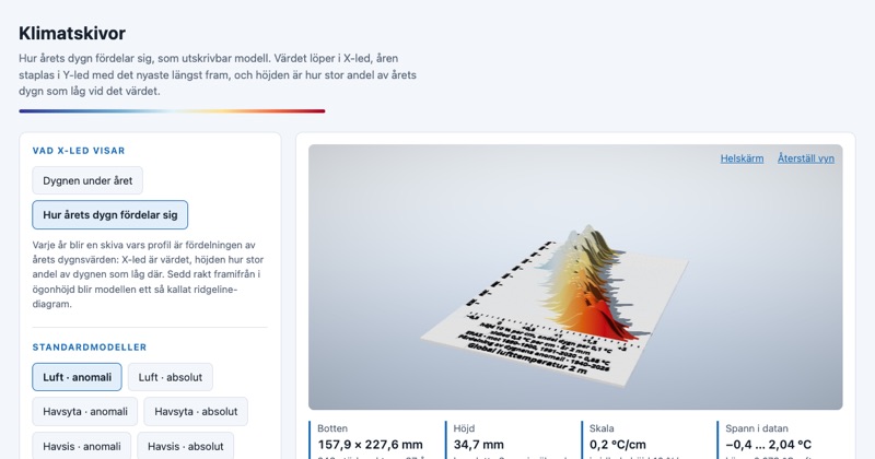
A year of global temperature as a printed disc
Klimatskivor turns every year since 1940 into a printable disc showing how its days were distributed against pre-industrial temperature. It's a ridgeline chart you can hold, with a QR code on the bottom that links to the exact model.
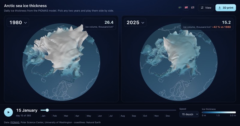
Arctic sea ice, any two years since 1979
Two globes side by side showing daily Arctic sea ice thickness from PIOMAS. Pick any two years from 1979 to 2025, play them day by day, and print the ice as a 3D puck.
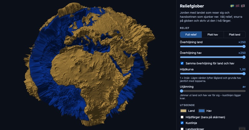
Relief globes, now open source
An interactive globe where land rises and the sea floor sinks, exportable as two- or three-colour 3D prints. The code is now on GitHub under an MIT license.
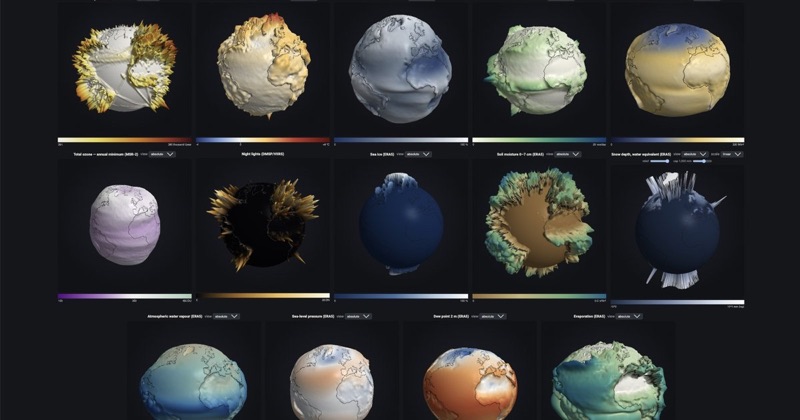
Printing climate globes in two halves
Colleagues asked for large printed climate globes. Making that work meant splitting the globe at the equator, adding a peg hole, and capping the extremes.